

Navisphere Vision
Building a new logistics platform to help prevent shipping exceptions and millions of dollars of lost shipments.
Overview
Navisphere Vision is a platform that gives users real-time visibility into their shipment data across regions and transportation methods. Bringing in predictive analytics and real-time updates, Vision is an integrated, one stop shop for supply chain risk mitigation.
RESPONSIBILITIES
As a designer embedded within the Vision team my responsibilities included working with product manager on feature prioritization, collaborating with engineers and data scientists to come up with performant, high value solutions. I designed unified user experiences that are visually appealing and technically feasible, and conducted user research and design validation on current and new features.
The problem with supply chains…
Supply chains today are usually managed in legacy platforms with minimum features. Supply Chain managers have to juggle different platforms for each transportation mode, and often there is no digital shipment tracking for some shipments, which means a lot of time spent tracking down shipment tracking.
Vision pulls data and status updates from third party vendors and suppliers—plus weather, traffic, and geopolitical monitoring—to give clients a holistic, real-time view of supply chains. This holistic view not only enables easier identification of exception shipments, but can help achieve greater supply chain resilience by allowing clients to proactively track, monitor, and react to disruptions before they occur with predictive analysis and modeling.
OUR GOAL
Redesign + Re-platform
The current UI of Navisphere Vision was extremely inconsistent and had been built in a way that was causing performance and scalability issues. The existing navigation was not scalable so adding additional features was difficult or impossible. Existing features were hard to use which led to users constantly asking for features we already had. We were tasked with redesigning and re-platforming the Vision platform to make it more usable, scalable, and consistent.
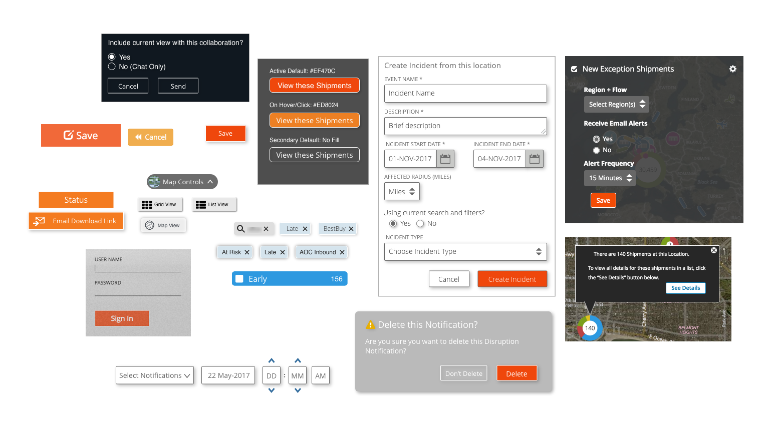
Examples of the existing UI elements across the platform.

Select synthesis deck slides from client research sessions.
But first, Research…
As part of our partnership with Microsoft, we did on-site user research sessions with a group of their supply chain managers, as well as sessions with their account managers at our subsidiary, TMC in Chicago. Two main problems with the current UI emerged as part of these sessions.
Shipments appeared to be missing. The map and list view appeared to be two separate pages but the map view actually formed a filter on the shipment list. This meant that if a user was on the list page and searched for a shipment, it would not appear unless the map filter was over that shipments current location.
The Shipment cards and Shipment detail page were hard to navigate. Orders on multiple loads didn’t show the information for both loads, and the shipment tracking information was at the bottom of the page and users often didn’t even know it was there.
*BONUS PROBLEM*: Vision only performs as a desktop Experience.
#1. Shipments appear to be missing.
“I don’t use Vision because my shipments don’t show up when I search for them.”
Problem
The map and list view are connected by a bounding box filter, but the disconnect between the two views makes it confusing.
The List View button is often hidden by the filters so users don’t see it.
While the map is nice, users don’t really need it in their day to day tasks. Most common task is searching for specific shipments.
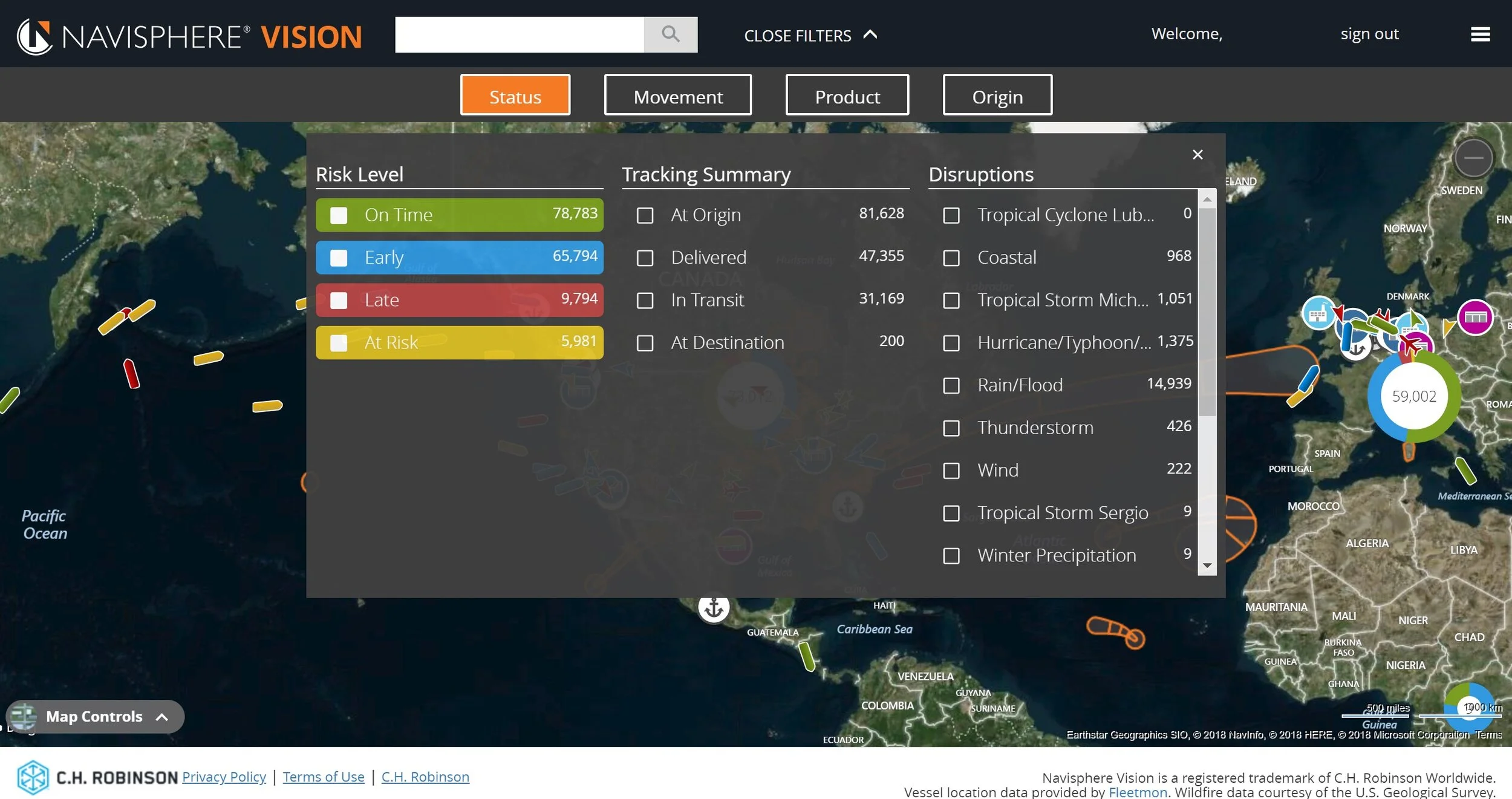
The existing UI when I joined the Navisphere Vision Team
Insights
Users expect the filters to stay applied across all views of shipments
Most commonly used filters (Risk Level and Status) should be easily accessible
Make configurable filters based on LOB or Business Unit in order to cut down on the number of items within a filter (i.e. A user may manage only Ocean Shipments, so don’t show any of the other areas in order to help them focus on their Mode)

Solution
I redesigned the shell of the platform to account for consistent and simplified navigation, page hierarchy, and loads of data.
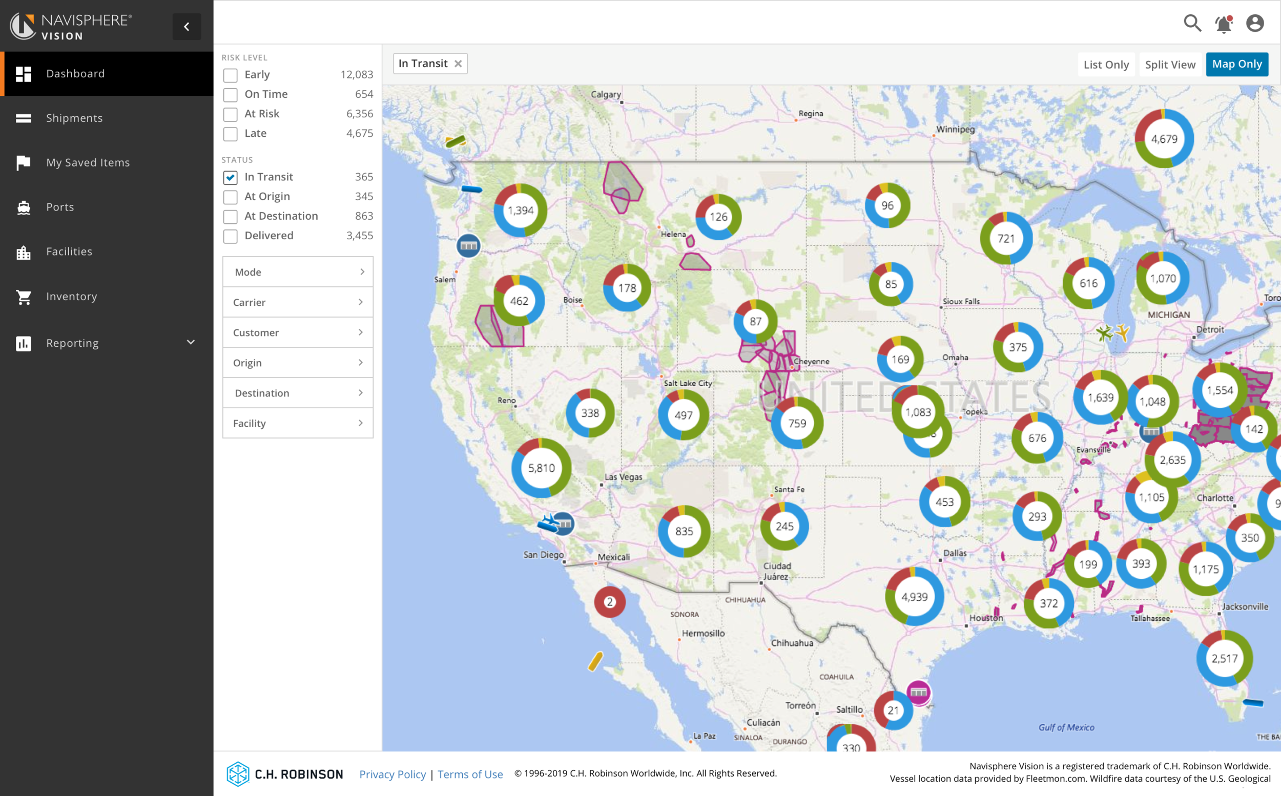
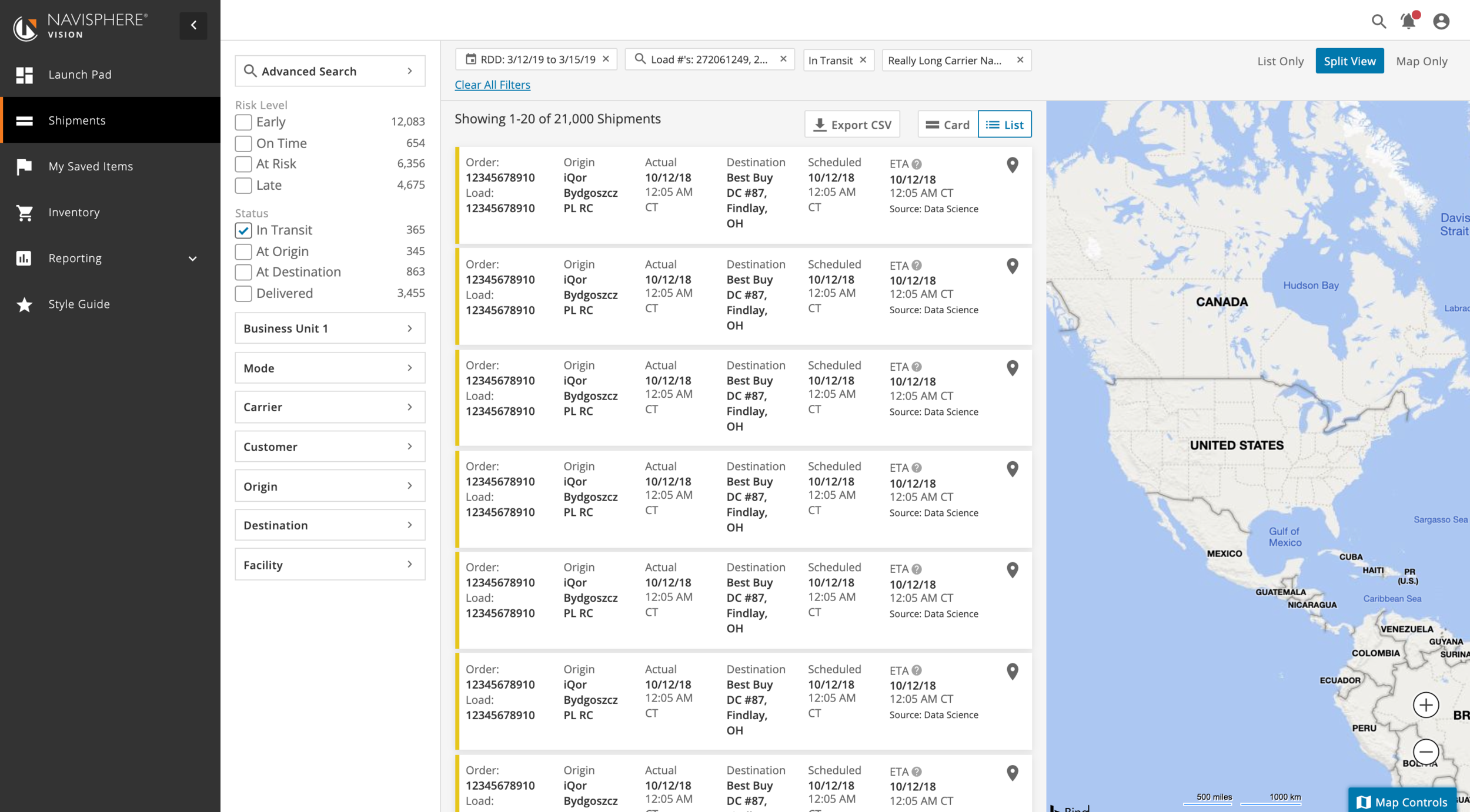
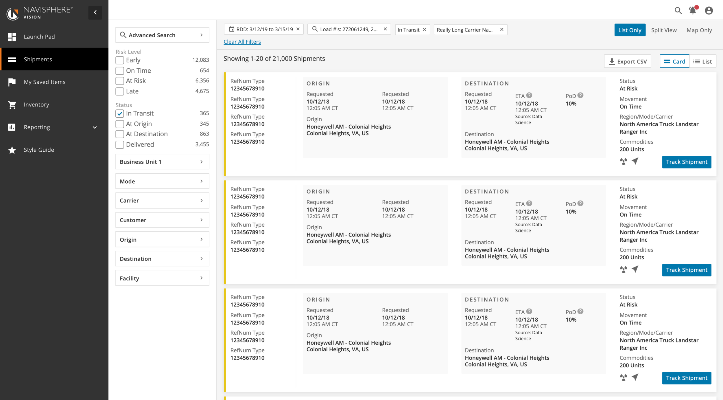
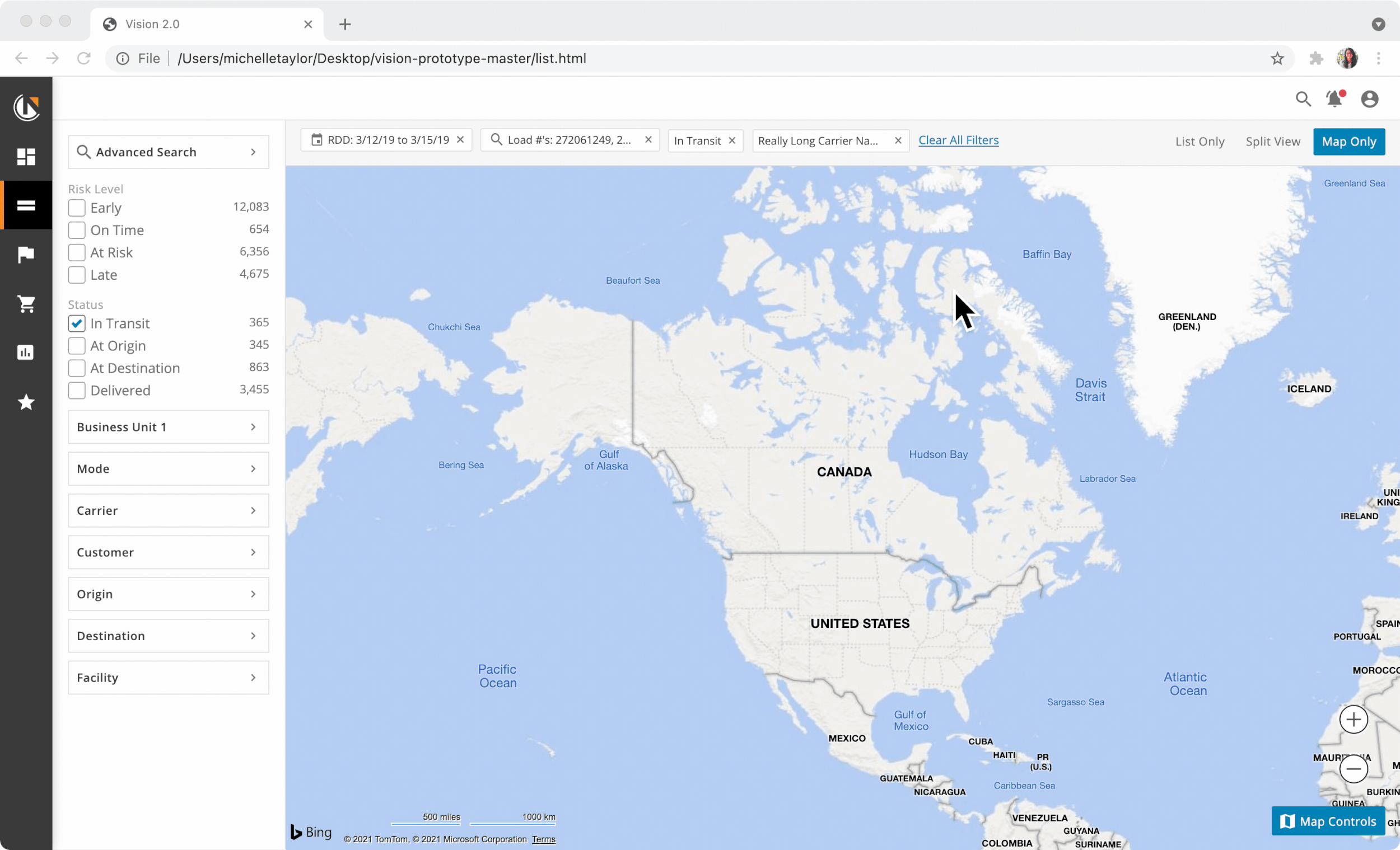
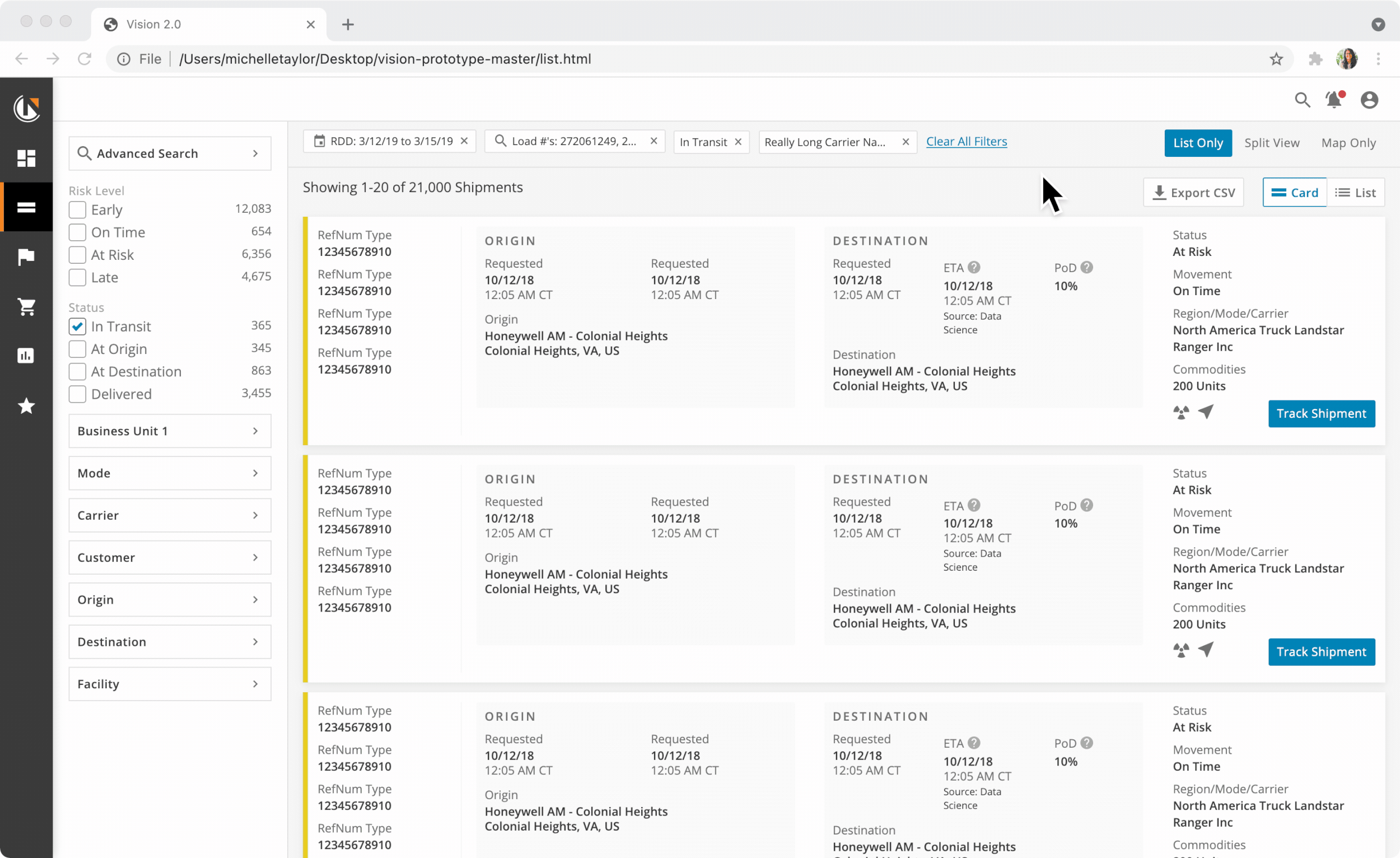
The shipments page was redesigned to be one page with different view options, treating the map view like the filter it is. This view gives users an option to view the map, list, or a split view which filters the condensed list by the map bounding box.
The left hand naviagation can be pinned open or collapsed, which gives more real estate to the important shipment data in the list.
Everything was designed to be fully responsive to give users access no matter where they are.

Map Only View
Split View
List View
In order to test out and prototype my navigation and shipments page concept, I created a fully coded prototype containing the front end of most of the major features within the platform.
This helped the team further understand how the interactions between the map and list view would work. This then become the platform for thinking about the UI of new features, most of which were designed in-browser.
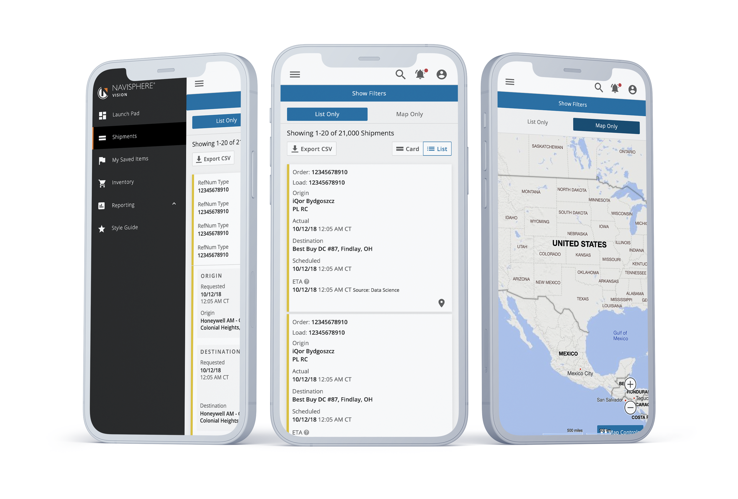
Some elements were cut from the mobile view, such as the split map and list view because of limited screen space at the smaller sizes.
#2. Shipment Cards and Detail Page
“I need to find the tracking details, and know if the shipment is actually late”
Problem
Load information is disconnected from load tracking details.
Cards do not show orders on multiple loads (the origin and destination may not be accurate).
No real data hierarchy, hard to pick out the information needed
Hard to find link to the full Detail Page to track the shipment, most users didn’t know the shipment detail page existed.
Need to account for multiple purchase order numbers (could be more than 100 PO numbers).
New features were hard to add to a page already crowded with information.
Previous versions of shipment card and detail page
Insights
Users need to see more dates. The shipment status isnt always accurate so they need to compare the requested dates and ETA, and also know what the source of the ETA source.
Reference numbers vary by clients, some numbers may have over a hundred values and need to be searchable, or apparent in the UI.
Shipments on Multiple loads need to distinguish between the load origin and destination and the shipment origin and destination.

Where is this ETA from?
Having several sources of an ETA, and also displaying a “Probability of Delay” meant that we needed to be clear what we were showing. Carrier ETA’s are extremely unreliable, so our users wanted to know if the ETAs were from the carrier. Our probability of delay was calculated based on additional data like weather impacts and

Solution
I redesigned the shipment tracker page to be more scalable, responsive, and highlight the important information in a more digestible manner.
Multiple Loads were separated into expandable cards in the load details tab to account for a shipment on many loads, each with up to 10 different dates for the origin and destination.
Tracking information was given its own tab.
With this new layout we were also able to explore how we might continue to grow this page, like adding commodity information for the shipment, and building upon our collaboration feature.

Conclusion
With an abundance of new features coming down the pipeline, like including more information on Ports and Facilities, this new UI and shell for the platform was a solid base to build upon and add new features. We were able to test out UI extremely fast with the front end prototype and solve some of the major user problems that were preventing our clients from using the platform.
The style guide set the team up for success to continue to have a consistent UI to pull from which allowed us to get features out to market faster, and start to explore more ways to make at risk shipments more actionable.
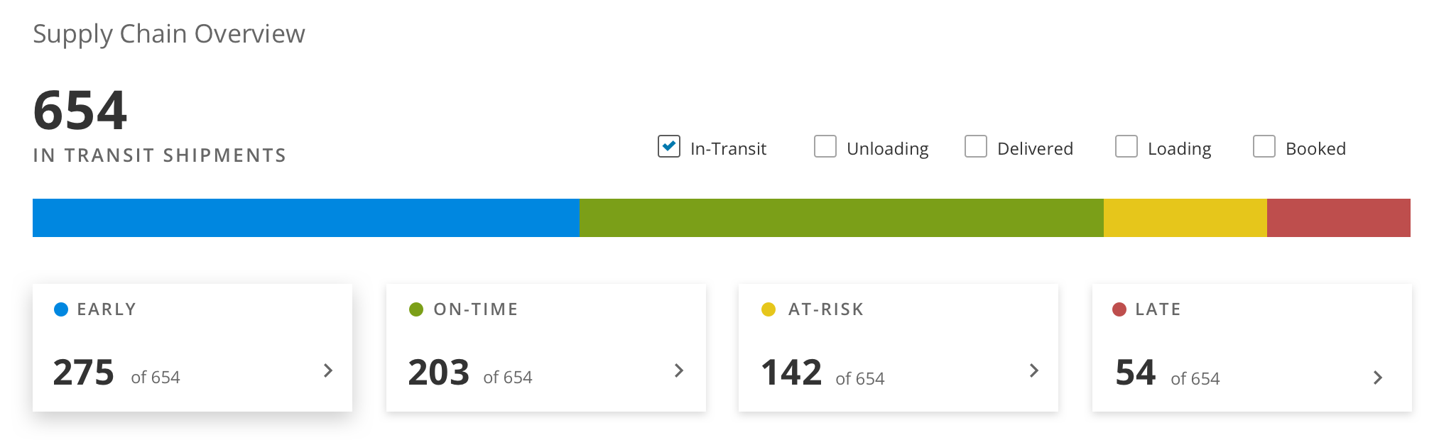
Beginning stages of a concept for a dashboard page to give a high level view of a clients supply chain.